Classic Folklore Books
Reader’s Edition
Below is a publisher-grade framework showing how to turn the same old text into a distinct, collectible book.
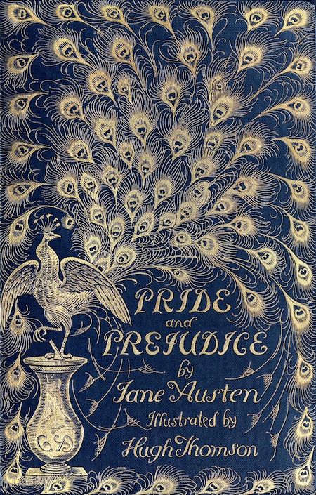
1. Design identity, your strongest differentiator
4
Most reprints fail because they look generic. Yours shouldn’t.
Ways to stand out visually
- Custom trim size choice (5×8 vs 6×9)
- Wider margins for a “luxury” feel
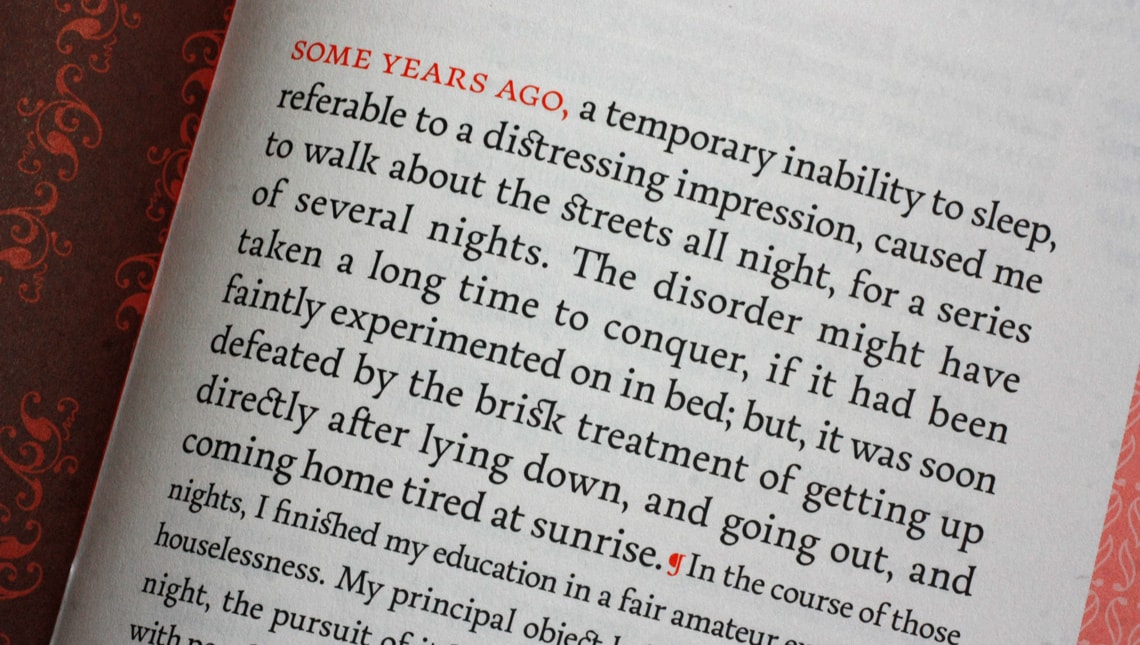
- Old-style serif fonts (EB Garamond, Caslon, Baskerville)
- Small caps for chapter openings
- Drop caps or ornamental initials
- Custom chapter dividers (lines, symbols, folklore motifs)
📌 Readers notice design before text.
2. Add original front matter (this is legal & powerful)
You cannot copyright the story, but you can copyright everything you add.
High-value additions
- Editor’s Foreword
- Cultural or historical introduction
- Why this story matters today
- Author context for modern readers
- Reading guide or reflection questions
This instantly transforms:
“Free book” → “Curated edition”
3. Create a themed edition (publishers’ secret weapon)

4
Instead of selling one book, sell a concept.
Examples
- Victorian Gothic Classics Series
- Forgotten Women Writers of the 1800s
- World Folktales, Annotated Edition
- Dark Fairy Tales for Adult Readers
- Colonial-era American Legends
Same text. Different audience.
4. Use typography to signal quality
Typography silently communicates professionalism.
Proven combinations
- Body: EB Garamond
- Chapter titles: Cinzel or Trajan-style serif
- Headers: Small caps, letter-spaced
- Poetry: Indented block with extra leading
Avoid:
- Times New Roman
- Default Word styles
- Tight margins
A well-typeset book feels expensive even when it’s POD.
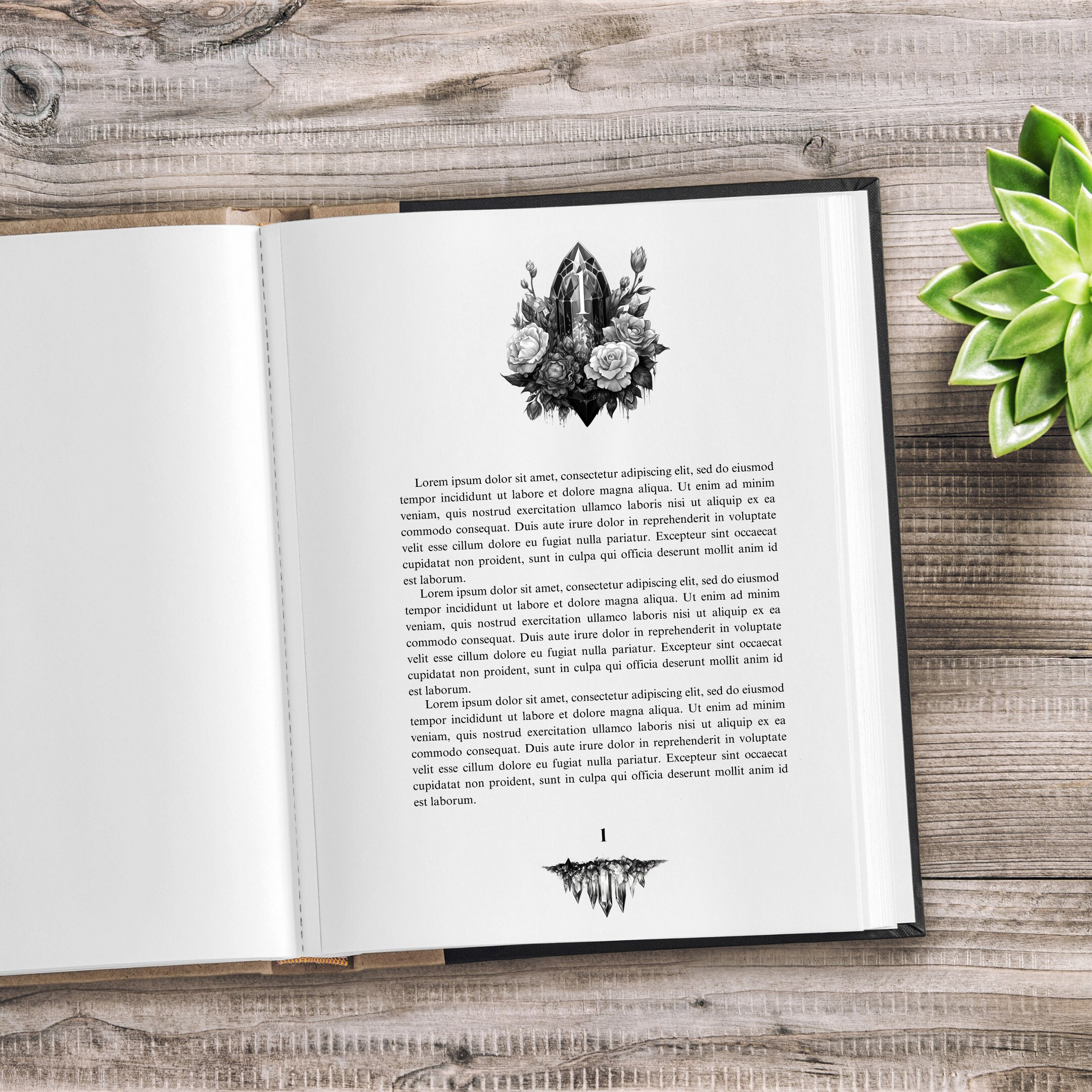
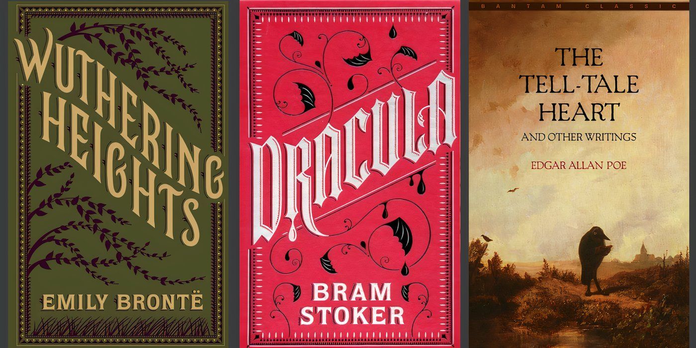
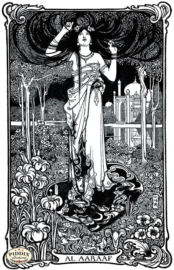
5. Add illustrations, even minimal ones


4
Illustrations don’t have to be many.
Options
- 5–10 public-domain engravings
- Chapter header ornaments
- One illustration per section
- Decorative end pages
Black-and-white only = cheaper print, classic look.
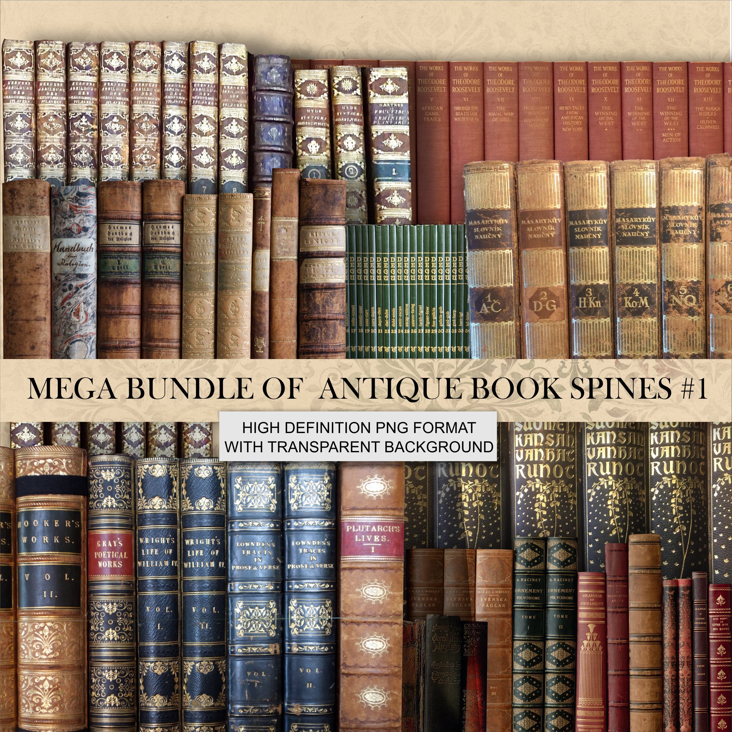
6. Curate collections, not just single titles
Instead of:
Alice’s Adventures in Wonderland
Create:
“Three Forgotten Fairy Fantasies of the 19th Century”
Why collections work
- Higher page count → higher perceived value
- Fewer competitors
- Better pricing power
- Stronger branding
Curation is authorship.
7. Develop a recognizable series style
4
Consistency builds trust.
Series elements
- Same trim size
- Same fonts
- Same margin rules
- Same cover layout
- Volume numbering
- Series introduction page
Readers buy series, not just books.
8. Your editorial voice matters
Two editions of the same text can feel completely different.
Your voice can be:
- Scholarly
- Storyteller-style
- Cultural preservationist
- Modern interpreter
- Folklore curator
A single page explaining why you chose this work creates connection.
9. Brand the experience, not the text
You are not selling:
“A public-domain book”
You are selling:
- Discovery
- Preservation
- Context
- Aesthetic pleasure
- Cultural storytelling
That’s what makes it unique.
10. What successful publishers actually do
Public-domain text
+ Editorial framing
+ Strong design language
+ Thematic positioning
+ Series consistency
= Original product
Legally sound. Creatively original. Commercially viable.
Leave a Reply