
4
1. Editorial voice (non-negotiable)
Narrative posture
- Oral storyteller meets careful curator
- Respectful, timeless, culturally grounded
- Never academic, never casual slang
Language rules
- Warm, descriptive introductions
- No modern commentary inside the story text
- Cultural explanations placed before or after, never interrupting
Point of view
- Third-person
- Neutral but evocative
- No author intrusion inside the tale
2. Book structure (fixed across all titles)
Front matter (always in this order)
- Series title page
- Book title page
- Cultural origin page
- Editor’s Foreword (1–2 pages)
- Table of Contents
Body
- Story text OR curated story collection
- Each story starts on a right-hand page
Back matter
- Notes on the Tradition
- Glossary (if needed)
- Reading Guide or Reflection
- About the Series
3. Typography system (locked)
Body text
- Font: EB Garamond
- Size: 11 pt
- Leading: 1.3
- Alignment: Justified
- Hyphenation: On
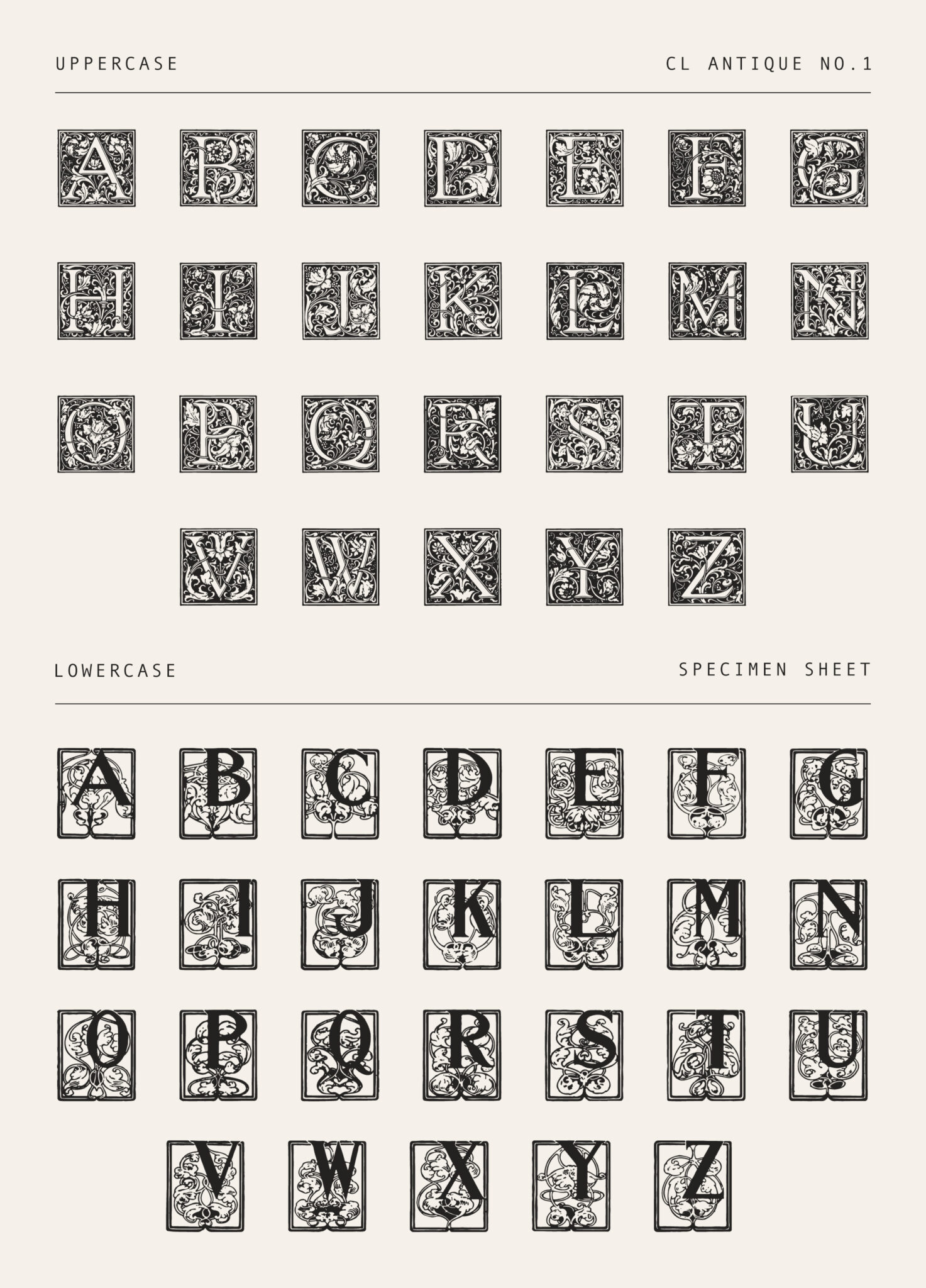
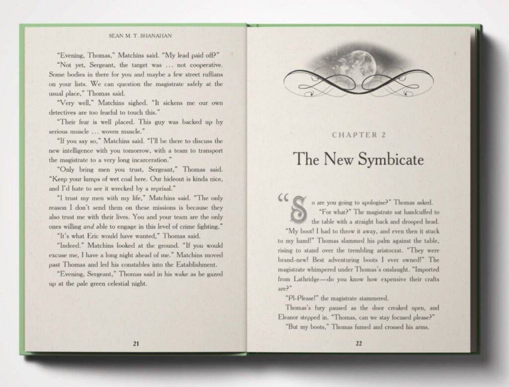
Chapter titles
- Font: Cinzel or Garamond SC
- Size: 16–18 pt
- Style: Small caps
- Placement: Centered, ⅓ down page
Paragraphs
- First-line indent: 0.25 in
- No space between paragraphs
- No indent after scene breaks
4. Margins & page geometry (5″ × 8″ trim)
| Area | Size |
|---|---|
| Inside (gutter) | 0.75 in |
| Outside | 0.5 in |
| Top | 0.75 in |
| Bottom | 0.75 in |
Running headers start after chapter openers only.
5. Chapter opening style (signature look)

4
Mandatory elements
- Chapter opens on odd page
- No header or page number
- Decorative initial (drop cap or ornament)
- Optional thin divider under title
This page is your brand moment.
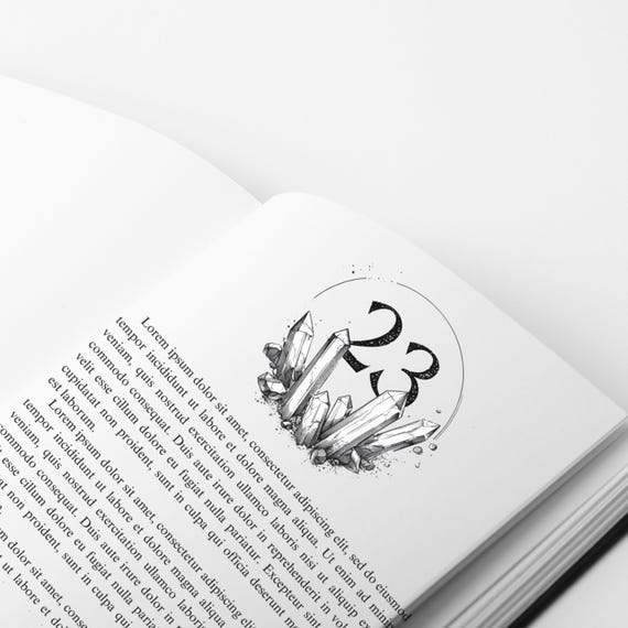
6. Illustrations & ornaments (controlled use)
Allowed
- Black-and-white engravings
- Cultural motifs
- Chapter ornaments
- Section dividers
Rules
- Never more than one illustration per chapter
- Always centered
- No captions inside story flow
- Credit in back matter only
7. Headers, footers & pagination
Headers
- Left pages: Book title
- Right pages: Story or chapter title
- Small caps or italic
- 8–9 pt
Page numbers
- Bottom outside corner
- Arabic numerals
- Start after front matter
8. Paper & print intent (Lulu-friendly)
- Black ink only
- Cream paper preferred
- No bleed
- No color elements
Designed for hardcover & paperback parity.
9. Cover alignment (interior must match)
Cover promise
- Vintage illustration or symbolic motif
- No modern photography
- Muted, earthy palette
Spine
- Series name
- Volume number
- Consistent typography
10. What makes this house style unique
You are not selling:
- Just a story
- Just folklore
You are selling:
- Preservation
- Respect
- Cultural continuity
- Timeless reading experience
This style signals:
“This book belongs on a shelf for generations.”
11. Locked rules (never break these)
- Same trim size across series
- Same fonts across all titles
- Same chapter structure
- Same voice discipline
- Same editorial framing
Consistency = authority.
PART 2
Classic Folklore Books, Reader’s Edition
1. EXACT placement of the edition name (do not vary)
A. Series title page (mandatory)
This is where the edition name officially lives.
Page order
- Series title page
- Book title page
Series title page layout
CLASSIC FOLKLORE BOOKS

Reader’s Edition
- Centered vertically and horizontally
- Same font across all books
- No author name
- No artwork
- No ISBN
This page establishes brand authority.
B. Book title page (secondary reference)
On the book title page, include it subtly:
Book Title

Author Name

Classic Folklore Books
Reader’s Edition
- Edition line is smaller than title
- Same placement in every volume
C. Back of title page (copyright page)
Include one neutral line:
This volume is published as part of the Classic Folklore Books, Reader’s Edition series.
That’s it. No repetition elsewhere.
D. Cover (optional but recommended)
Front cover:
- ❌ Do not clutter the front
Spine:
Book Title
Classic Folklore Books
Back cover (bottom line):
Reader’s Edition
2. WHAT GOES ON EVERY PAGE (LOCKED RULES)
This is what creates consistency and professionalism.
A. Running headers (mandatory)
Left-hand (even) pages
Classic Folklore Books
Right-hand (odd) pages
Book Title
Formatting:
- Small caps or italic
- 8–9 pt
- Starts after chapter opening pages
- Never on chapter openers
B. Page numbers (mandatory)
- Bottom outside corner
- Arabic numerals
- Start after front matter
- Same font as body, smaller size
C. Margins (never change)
- Inside (gutter): 0.75 in
- Outside: 0.5 in
- Top: 0.75 in
- Bottom: 0.75 in
This applies to every page.
D. Typography rules (never break)
- Same body font across all books
- Same paragraph indent
- Same line spacing
- No extra spacing between paragraphs
Readers subconsciously notice uniformity.
3. WHAT MUST NEVER APPEAR ON EVERY PAGE
This is as important as what does appear.
❌ Edition name on every page
❌ Logos
❌ Decorative ornaments in running text
❌ Footers with marketing text
❌ Inconsistent headers
Books are not websites.
4. WHERE THE EDITION IDENTITY LIVES (summary)
| Location | Included? |
|---|---|
| Series title page | ✅ YES |
| Book title page | ✅ YES |
| Copyright page | ✅ YES (one line) |
| Running headers | ❌ NO |
| Every page footer | ❌ NO |
This balance feels professional, restrained, and permanent.
5. WHY THIS WORKS (important logic)
- Readers recognize the edition early
- It does not distract from reading
- It builds series identity quietly
- It mirrors how major publishers do it
Authority comes from restraint, not repetition.
6. FINAL LOCKED DECISION (confirming)
Edition name:
Classic Folklore Books, Reader’s Edition
Appears:
- Series title page
- Book title page
- Copyright page
Every page includes only:
- Running header (series + title)
- Page number
- Consistent margins and type
Leave a Reply